Miles Trip Mangement
Manage trips and get better rewarded.
Overview
Miles is a universal rewards app empowering anyone to earn miles automatically for all forms of travel and commute.
The goal of the project is to redesign the iOS app of Miles - Trips. I wanted to provide a better experience for split trips. I designed solutions considering the impact on user acquisition, retention, engagement, and other attributes.
Timeline
May 2021
Role
User research
Interaction design
Visual design
Team
Individual Project
Methods
Persona
Competitive Analysis
A/B Testing
How do we reward a multi-mode trip?
🖇️
Difficulty of split & merge trips
Feel frustrated when the trip history is not accurate and no way to adjust
📍
Limited info for trip details
No way to enlarge the map to see the route & points breakdown
🧐
Interface & icons confusion
Icons hidden with the trip filters, similar interfaces cause confusion
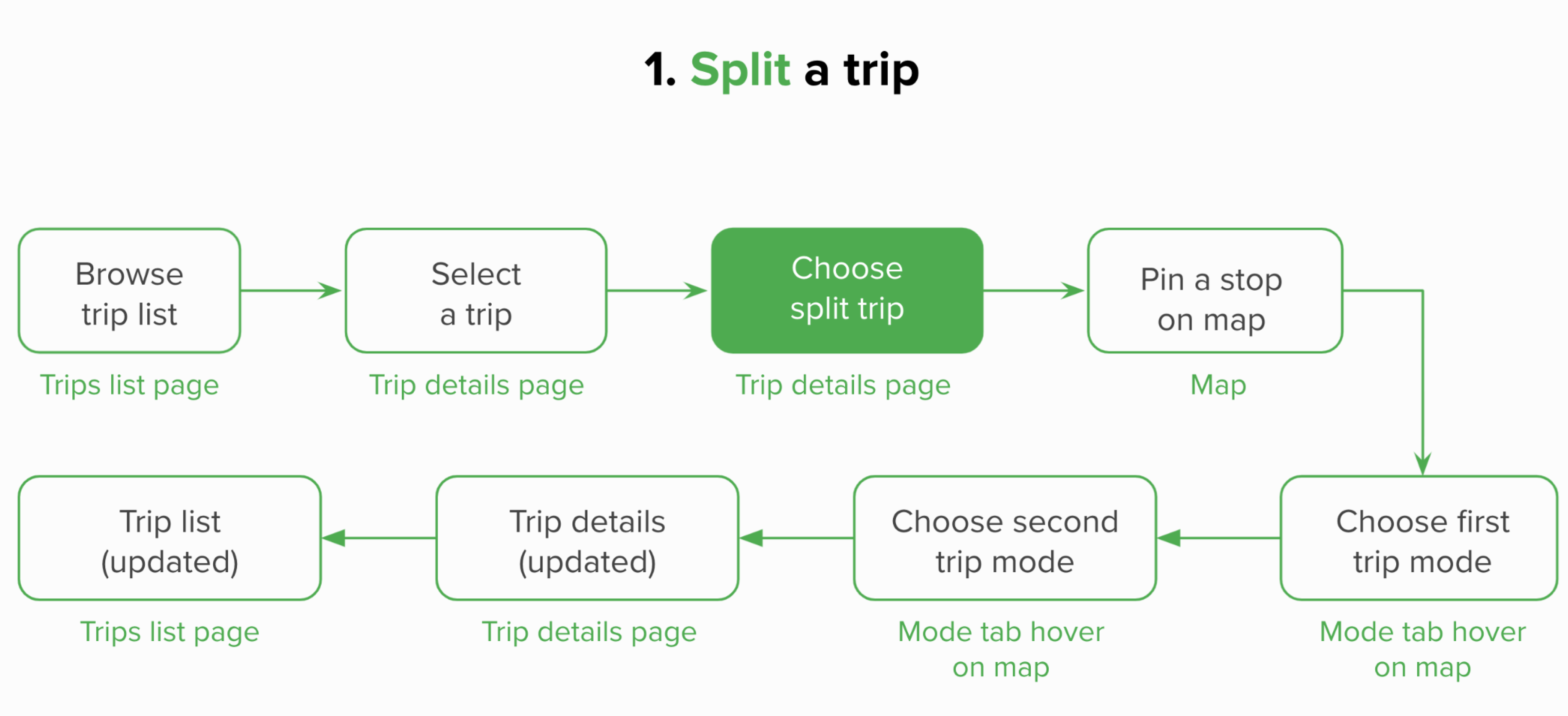
Split one journey into multiple trips

Split one journey into multiple trips
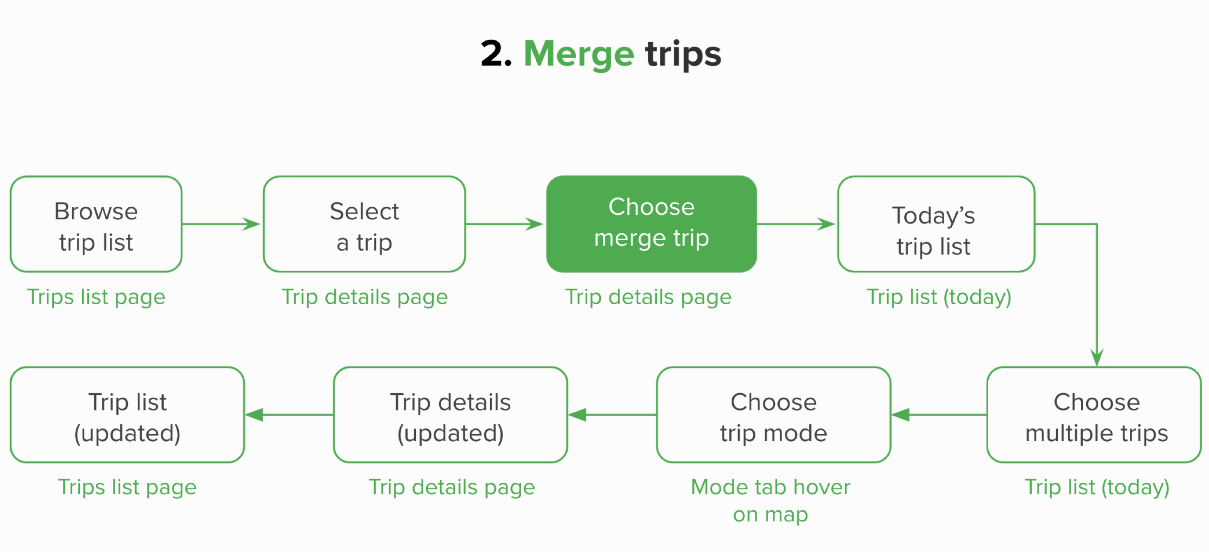
Merge multiple trips into one journey.
To understand Mile’s product goals and business strategy, I read an interview with PhocusWire. According to the article, Miles aims to accompany the users for every trip they make in the physical world, seamlessly awarding them miles without requiring any action on their part. By researching about the company, I was able to learn Mile’s user base and business & design goals.
To understand the context, first,
what is a multi-mode trip?
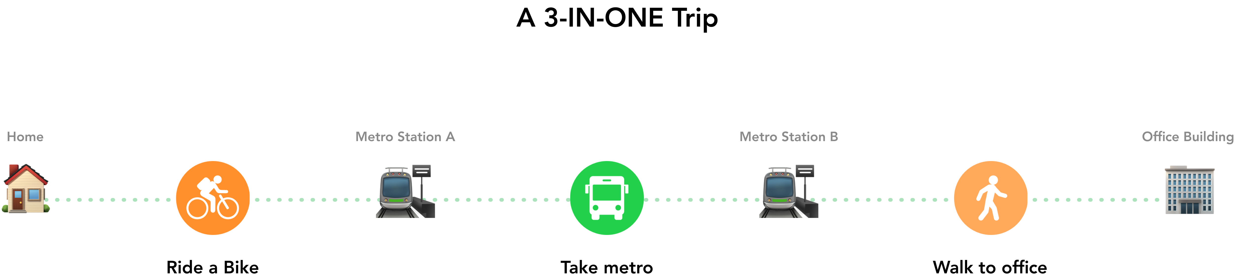
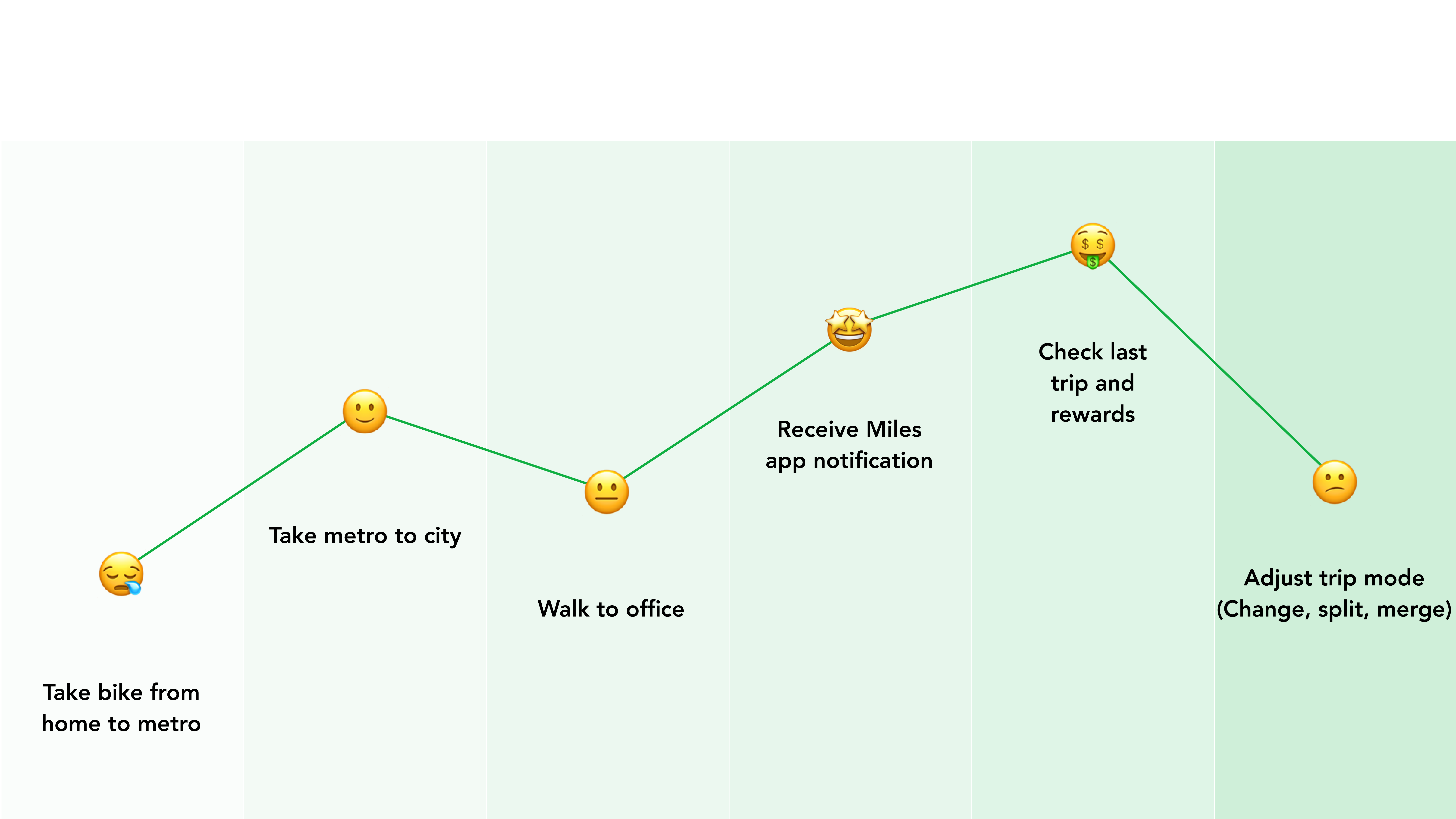
Let's take a real-world example:
-
I ride a bike from home to the Caltrain Station.
-
Then I commute from San Jose to SF where my office is in city.
-
Finally, I walk from the station to the office building.
Combined Bike, Metro, and Walk.
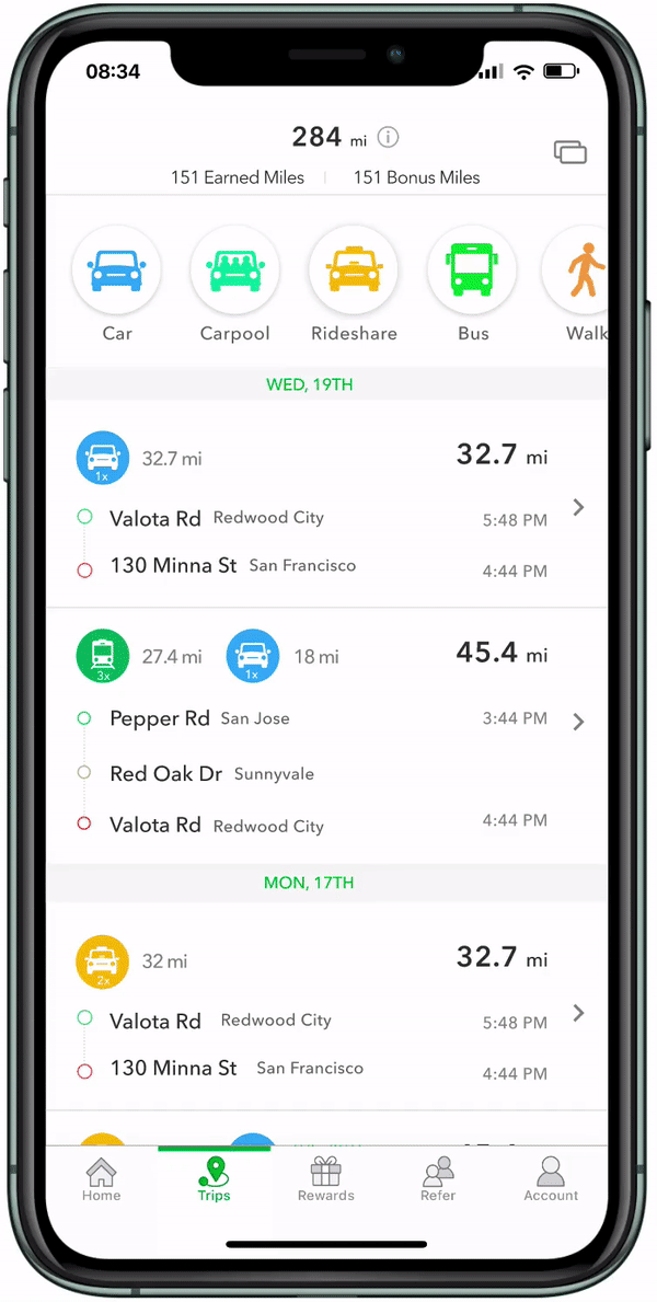
When I browsed through the app, I felt excited & confused.
The trips section in the list and the action items in each trip card were not clear and engaging to manage. Miles offers a trip mode button on the top left corner of each card, as a quick action to change trip mode, but for me, it was not easy to find especially when we add more actions as split and merge.
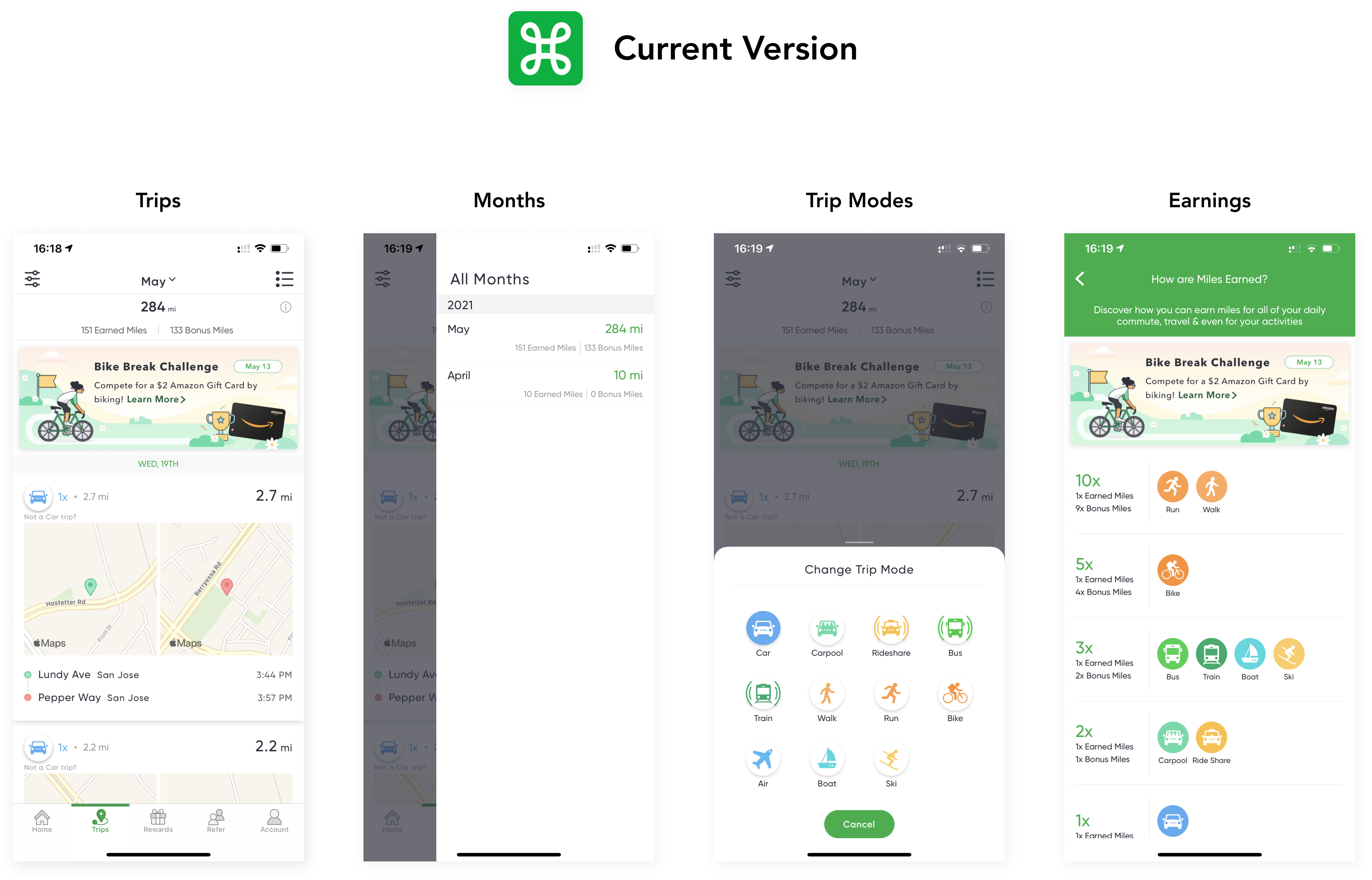
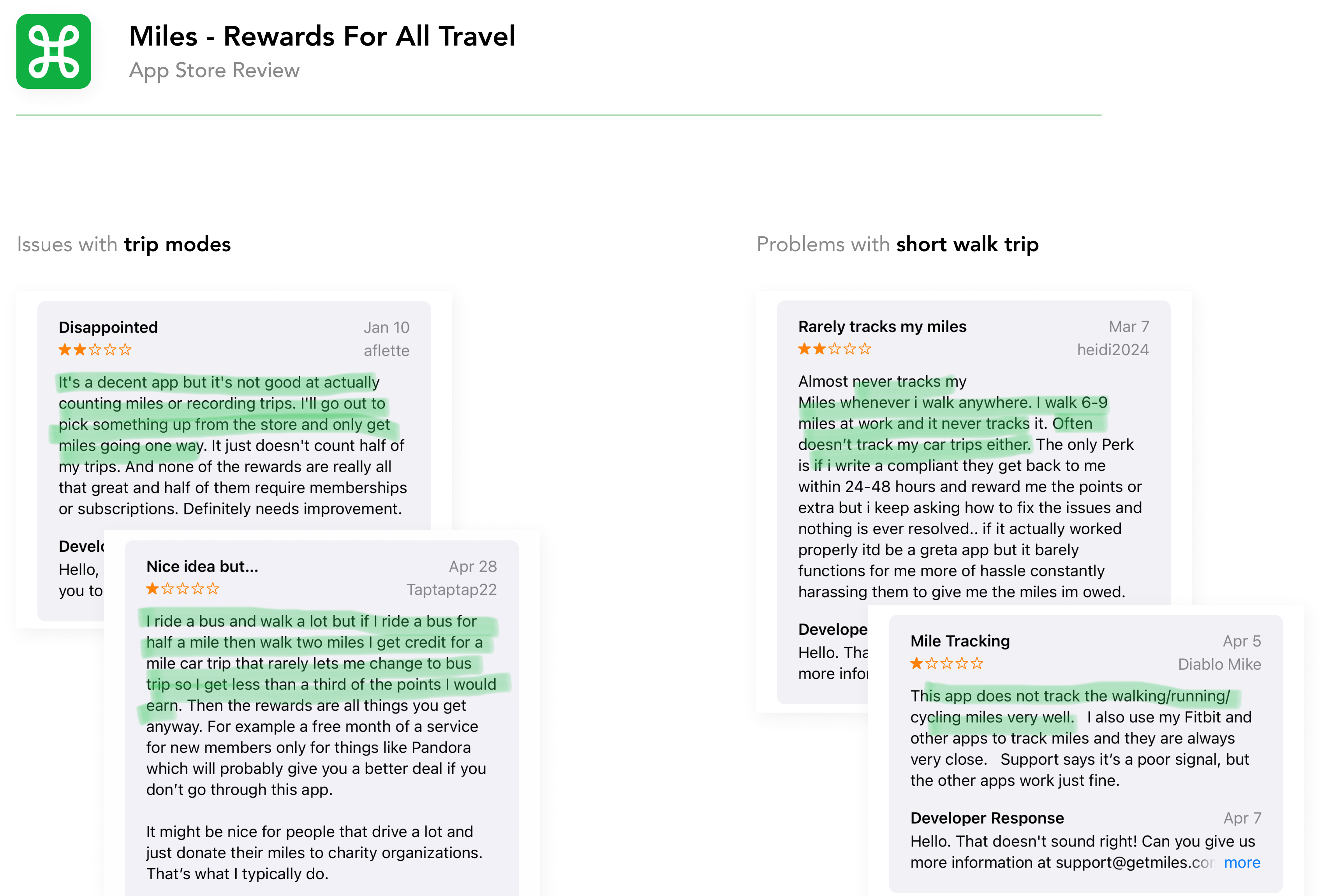
App store reviews
While research our users’ reviews from the app store, Users were having complaints about the following:
-
Difficult to count miles or record trips accurately. - Most Complained.
-
Doesn't count a short walk when combined with a long drive which causes them to lose triple points.
Now I have the Hypothesis is:
Users have difficulty counting and recording their trips with accurate trip modes.
How is the experience failed?
To test my hypothesis, and get a deeper understanding of the problem, How is the experience failed?
Qualitative Research
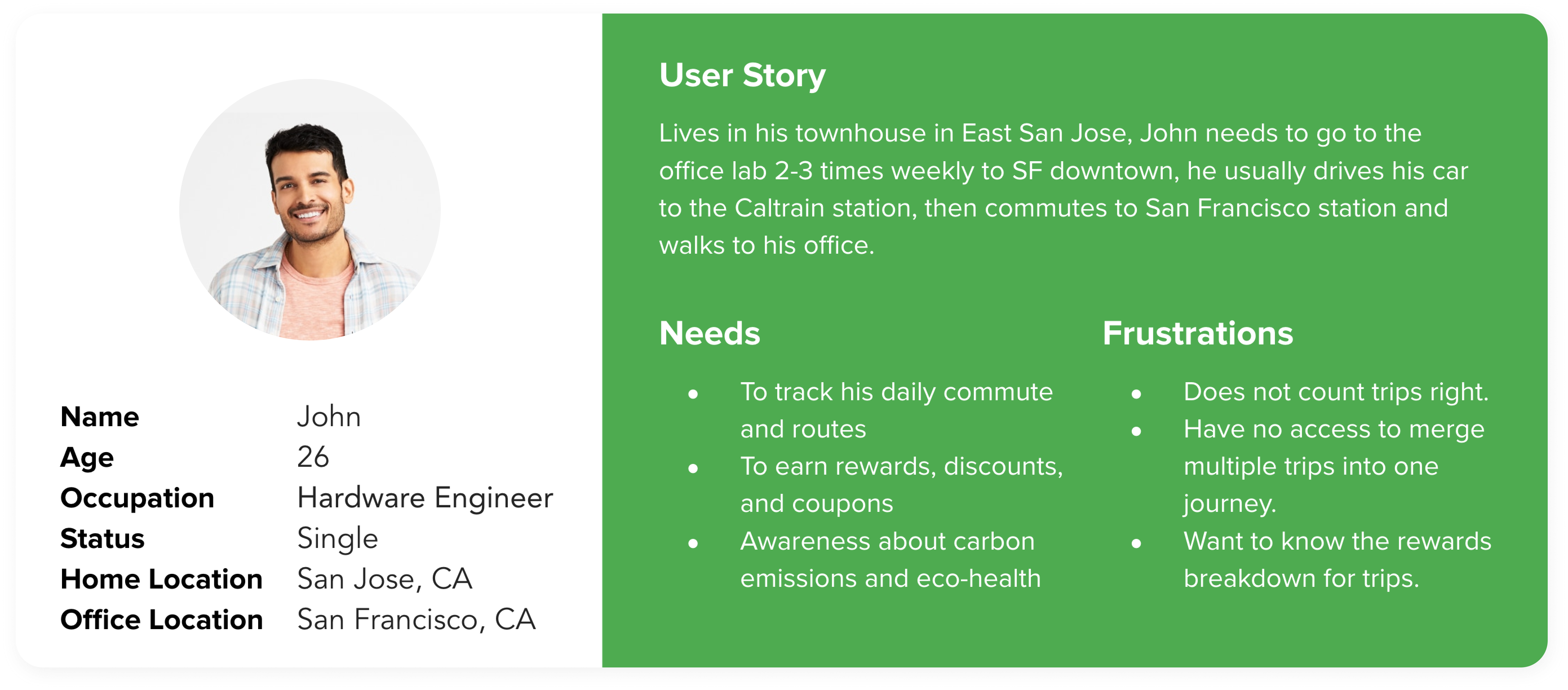
Referred 5 to my friends who have similar behaviors about trips to install Miles and asked them to freely browse and track using the app. Most of the test participants haven't heard of Miles, but very interested in the rewards and the business. After this, I created a persona John to represent our target user’s demographics, needs, and pain points.
Contextual observation
A lot of them were so surprised by the variety of types of rewards and coupons especially the donations that Miles offers. At the end of the test, I asked them how and which part of the experience they feel bad about. and other findings.
I wonder how other platforms do with trip-related experiences?
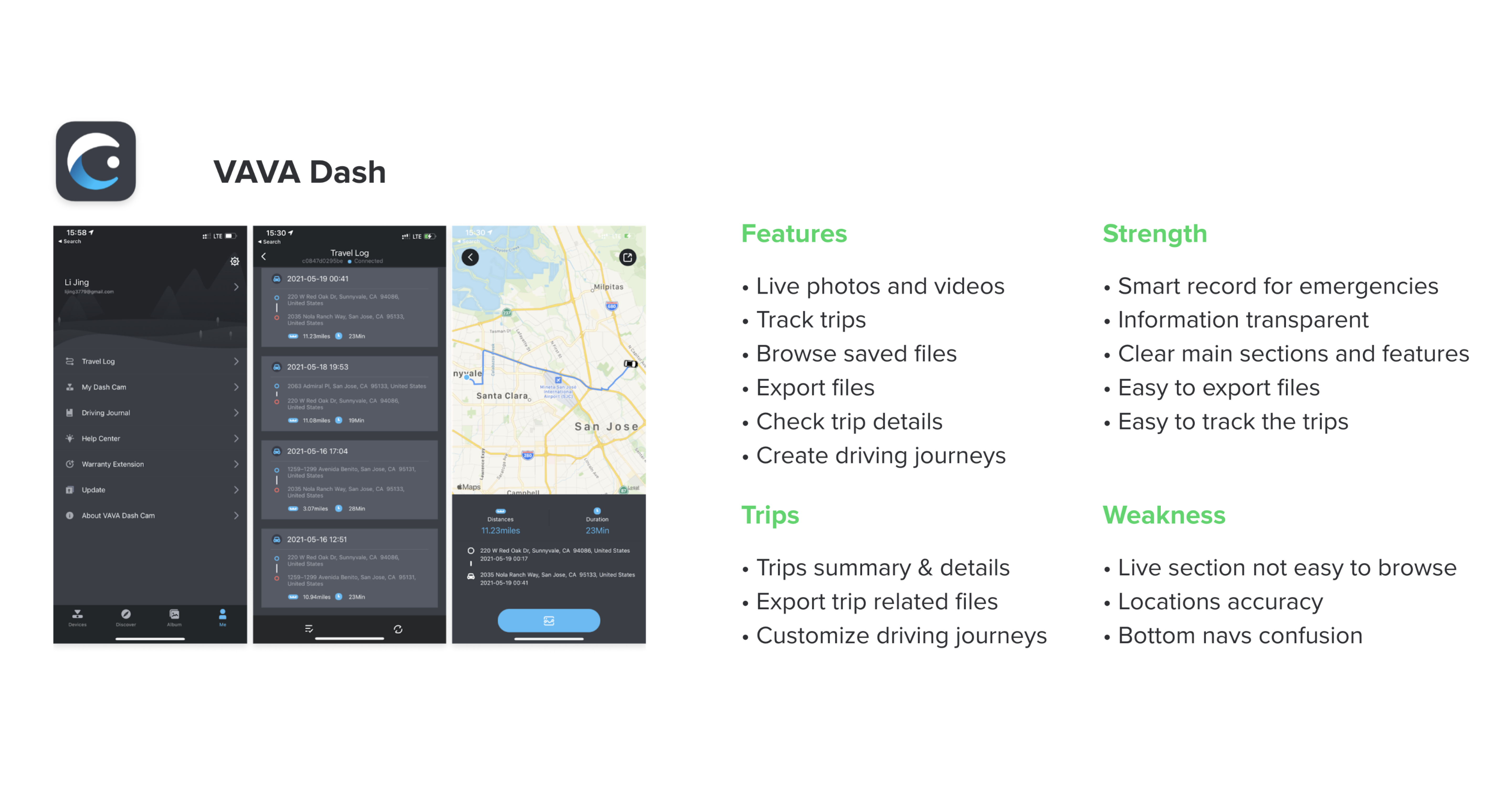
VAVA Dash, my own choice of my car’s dashcam, which to me offers simple and clear trip sections to view.
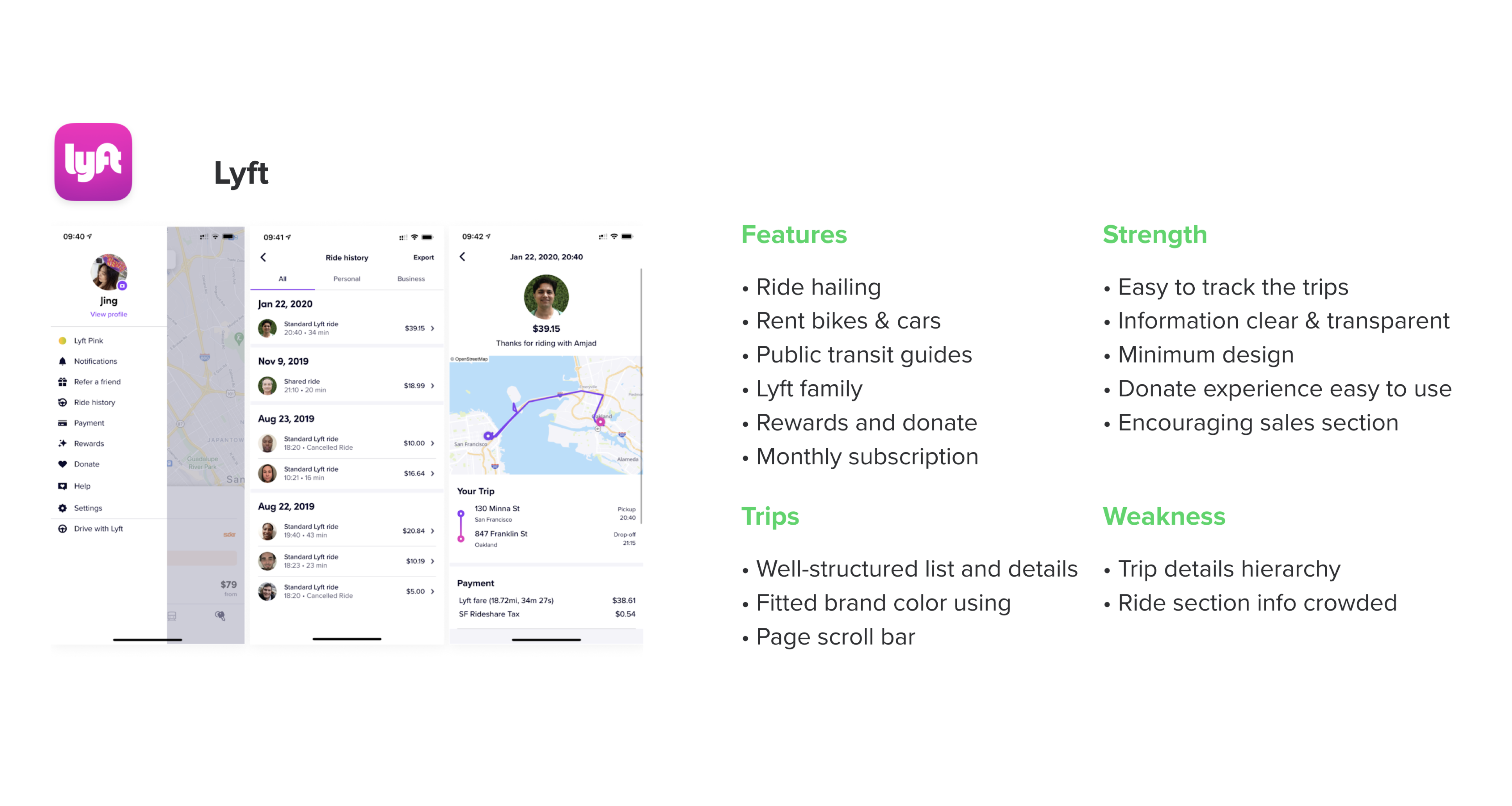
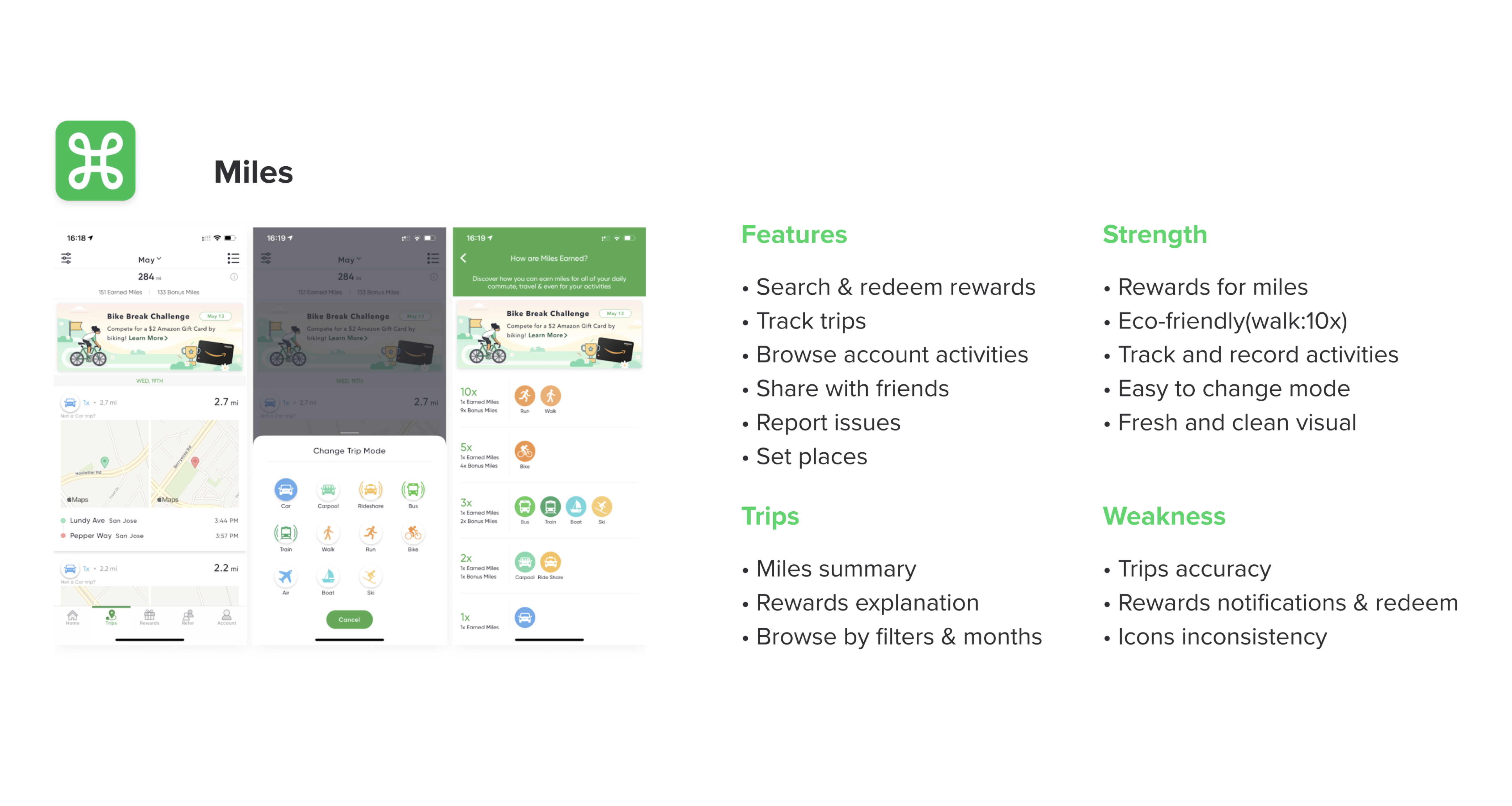
And others enterprises like Lyft which has a well-structured trip list and details.
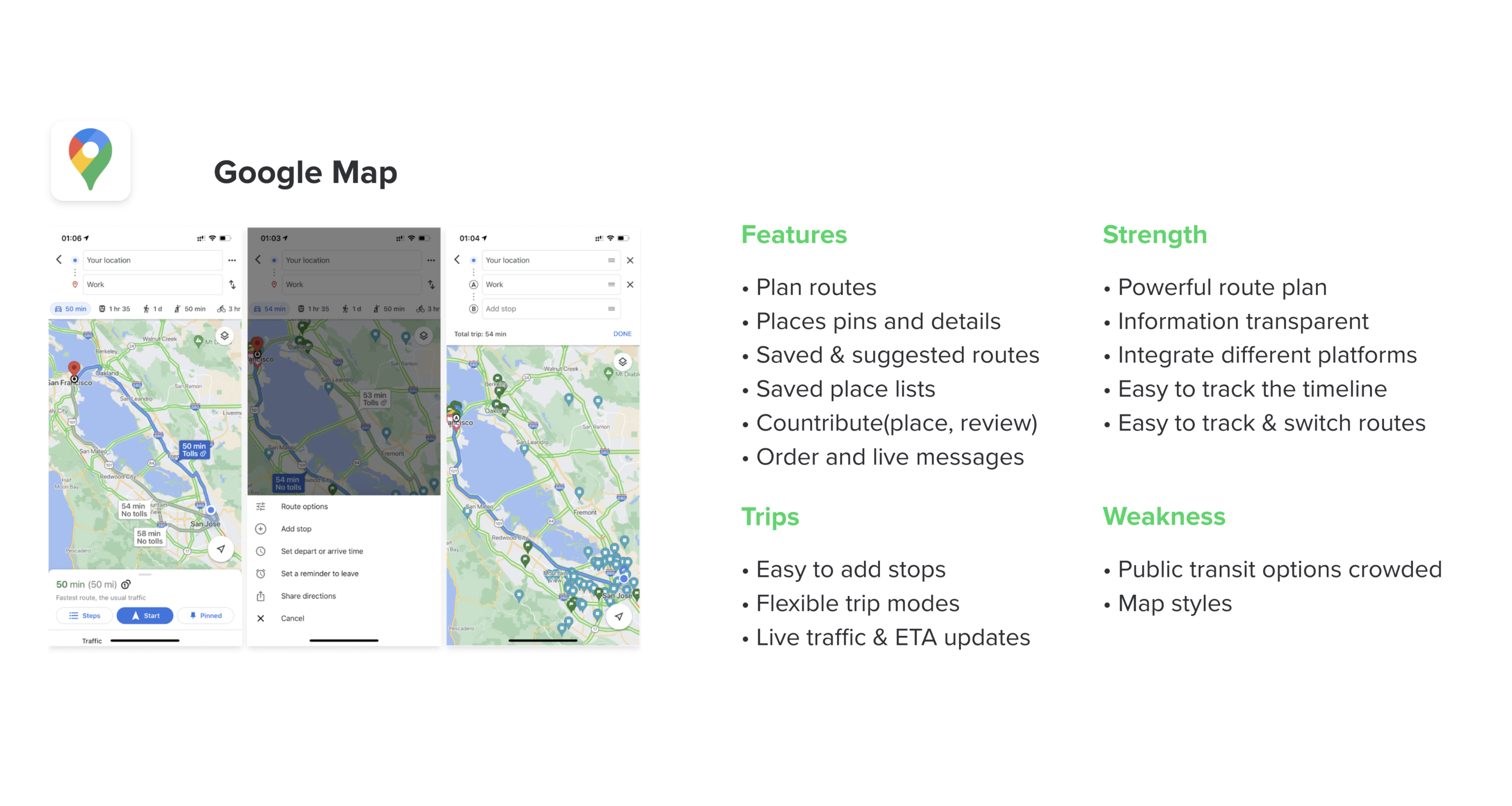
Google map, of course, has a powerful route plan and edit experience. I got a lot of inspirations to try in the next phase of researching competitors.
Set project goals and potential solutions.
So next step would be to clarify the goals, opportunities, and constraints of the project.
Improve the trip splitting and merging experience by making the trip list and details more engaging to users.
Design Opportunities
✂️
Split
-
Feel frustrated when the trip history is not accurate and there’s no split option available to adjust.
-
Want to choose accurate modes for multiple trips.
🔗
Merge
-
Want to combine trips into one journey.
-
Difficult to merge and adjust to correct mode.
✨
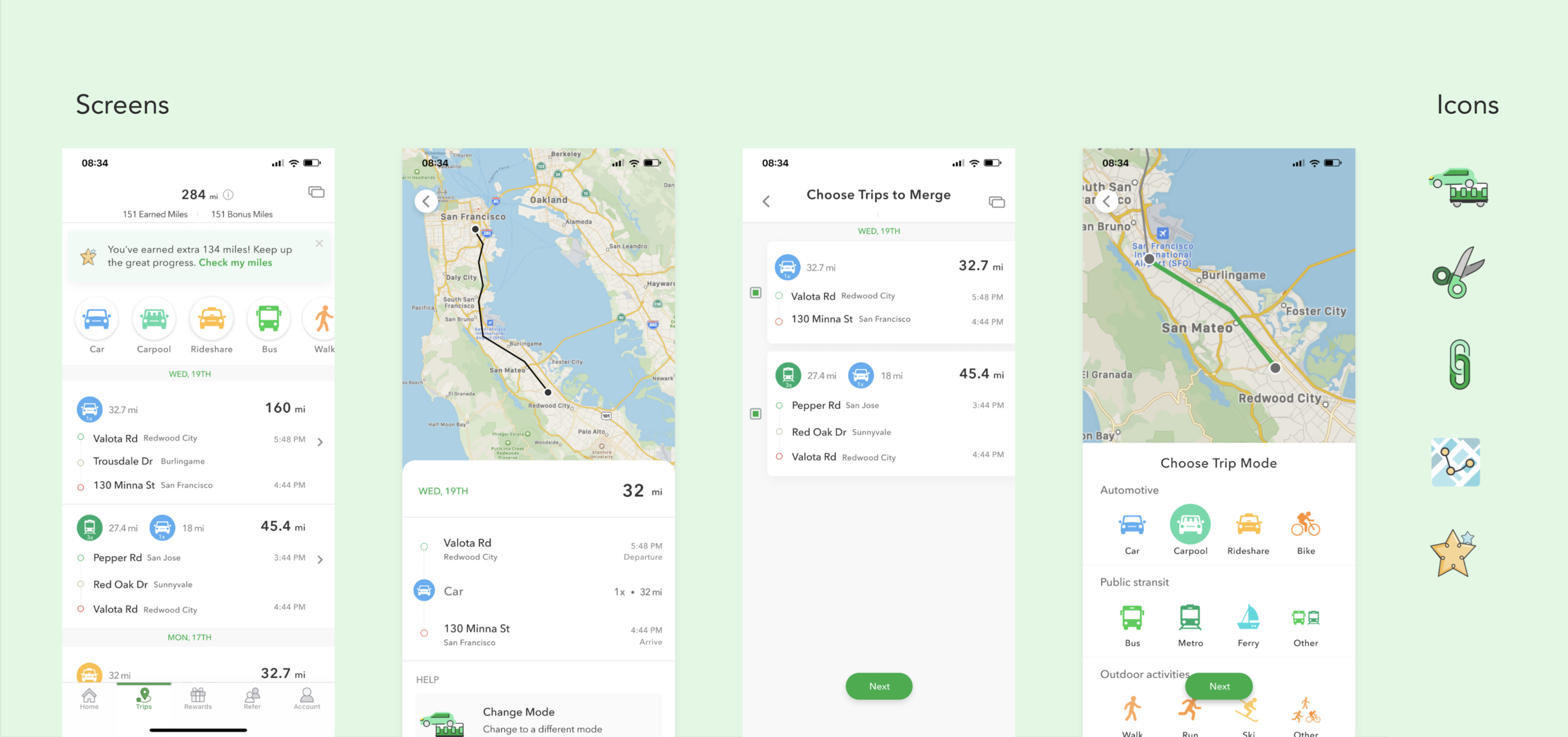
Trip Details
-
Want to know more about the trip.
-
Hard to know the rewards breakdown of 3-in-one trips.
Constraints
For a mature launched product, we need to stay close with our existing design system and make a consistent design with other sections.
Possible solutions:
-
Allow users to edit their trips in an actions list.
-
Offer detailed route and points breakdown by adding a details page.
Possible outcomes:
-
Actions become more engaging; therefore, trips are easy to browse and adjust.
-
Remind users to provide feedback and check their miles status to enhance app loyalty.
Take insights into visual exploration & execution.
With the findings and insight from research, the next step is to develop ideas and visualize the design solutions.
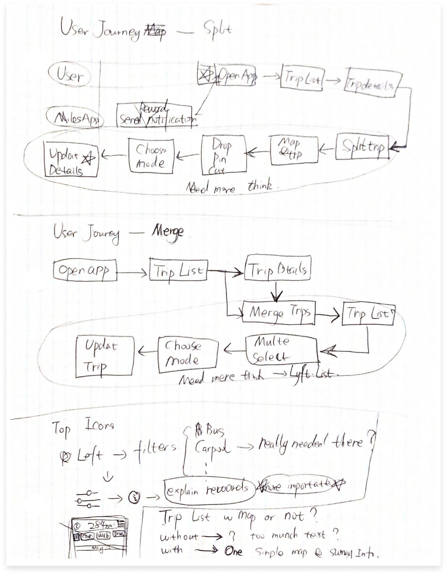
Brainstorming & Sketching
I started with brainstorming and sketching. As part of my design process, I usually write down the findings that I got from the User Research (Needs and Frustrations) and organize them so that I could prioritize the lists of functions/ features that should be redesigned.
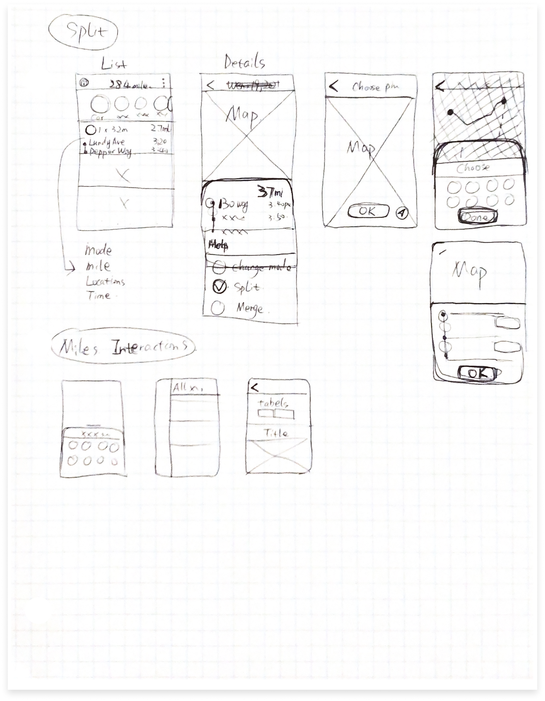
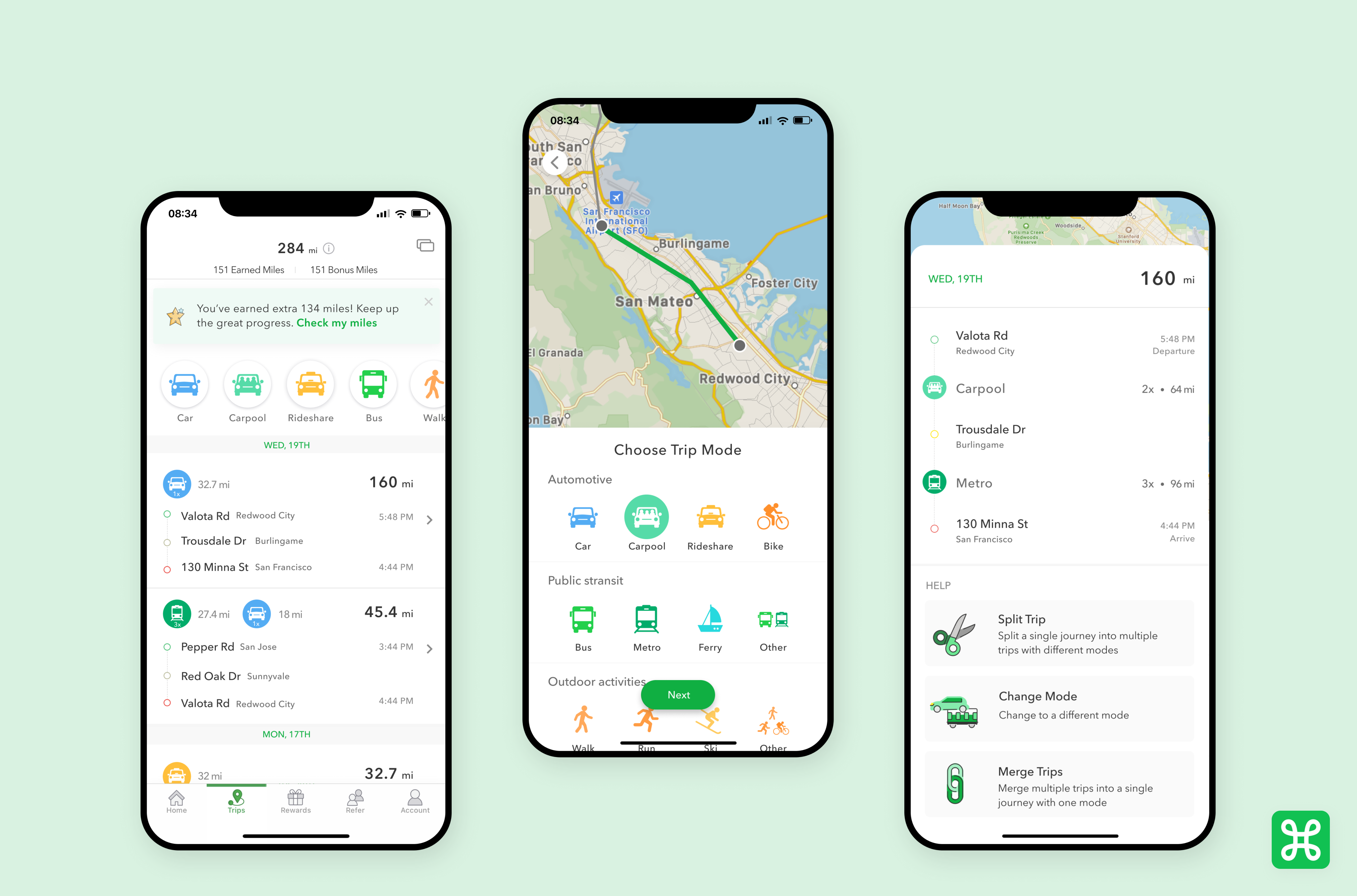
Mid-fidelity wireframes
Some pages show medium-fidelity wireframes. With these, I could quickly develop my idea to prototype and get tested. User testing matters at every stage of the design process, because we are user-centered. It helps me to either choose a design direction or improve ideas.
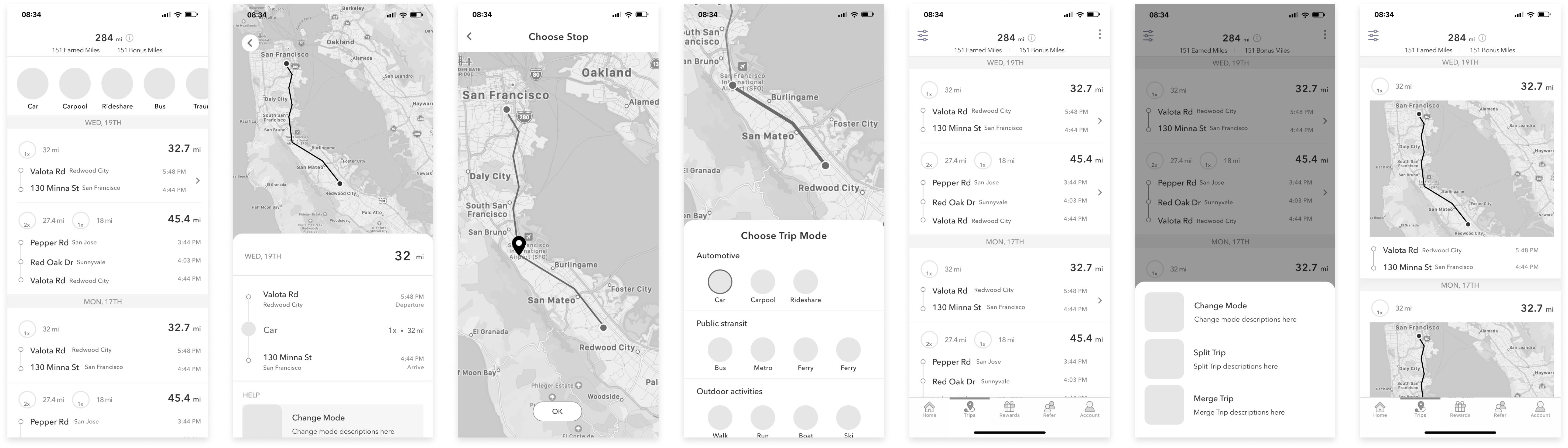
In order to make the trip details and actions(split & merge) more engaging to users, I came up with the idea of adding an action list including User testing matters at every stage of the design process, because we adjust trip mode trip mode, split trip, and merge trips. It will help users better manage their trips. I explored adding the idea to the existing screens and narrowed it down to two versions.
Variation of showing trip history and choosing the edit options.
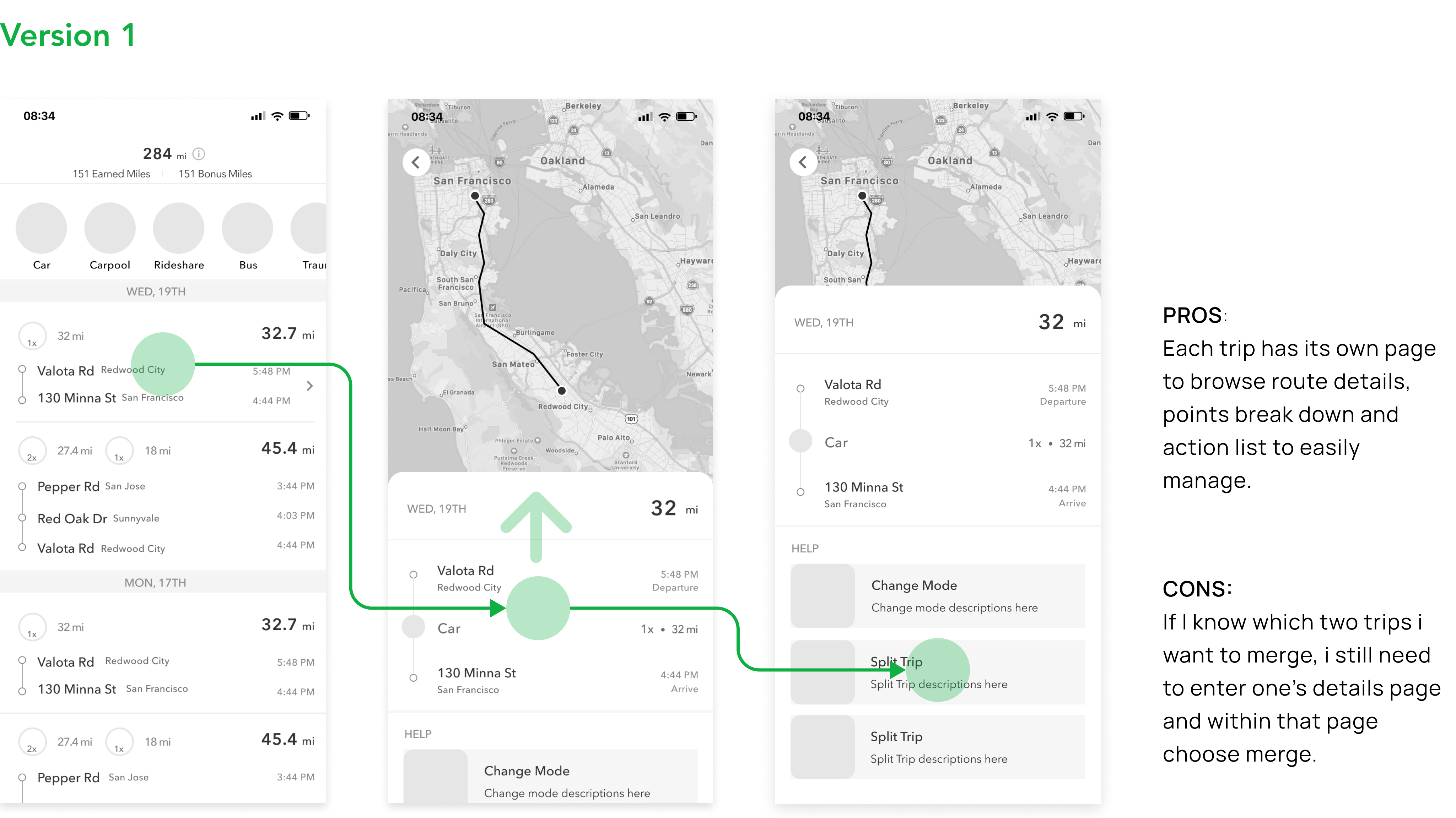
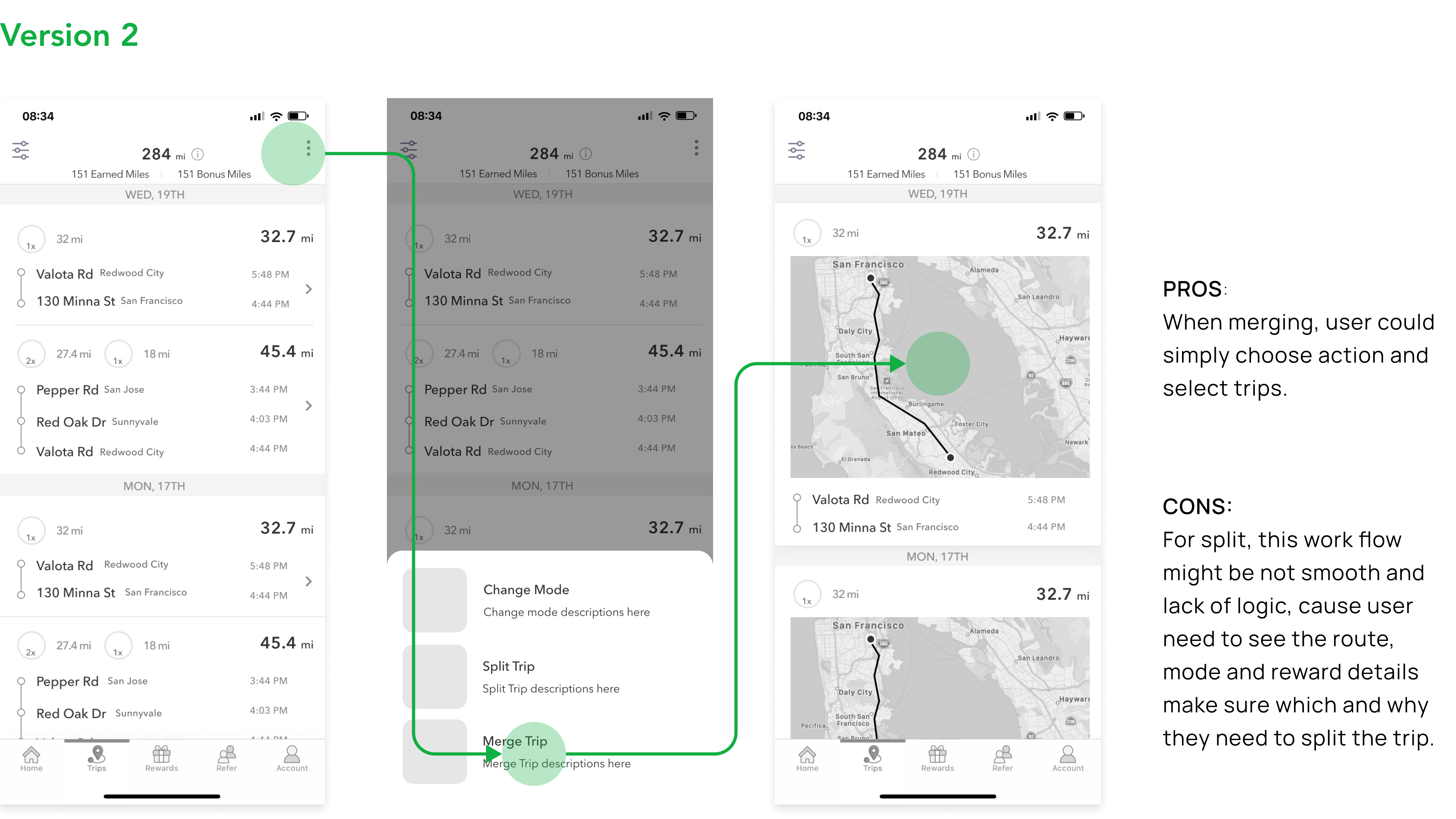
I decided to go with version one.
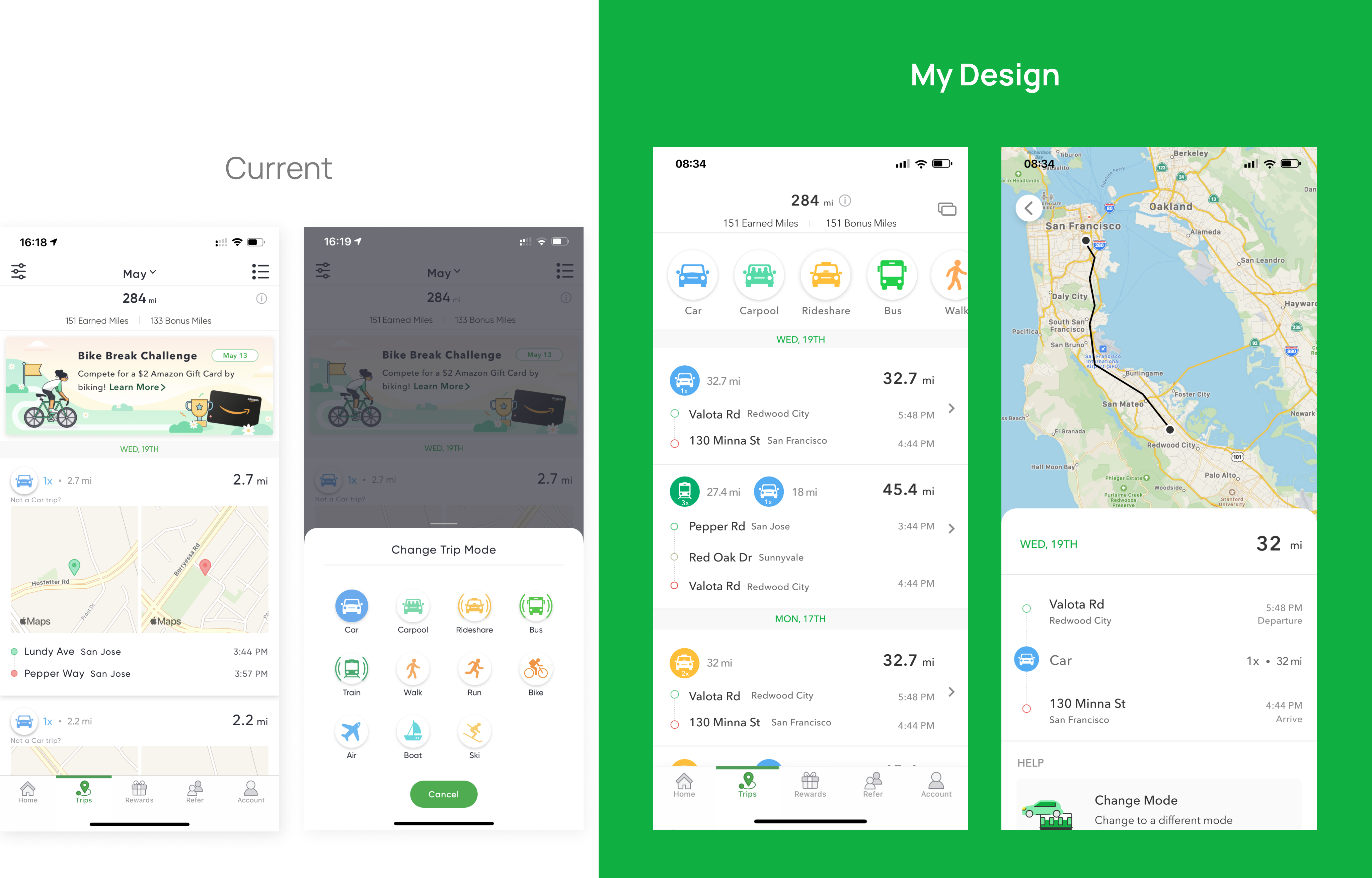
Current
- Trips display as cards list in the trip section.
- Internal messages or ads to encourage user travels.
- Mode filters are kinda hidden as an icon on the top left.
Redesigned
- Trips are summarised in the past trips list.
- New details page to enlarge the map route to visualize the trip history with mode details.
- Modes are visualized added to the upper category bar like browse by trip mode.
Get back to John’s scenarios.
Improvement
- Allow users to edit their trips in an actions list.
- Help users to select a trip edit option and choose stops & modes to update miles earned more bonus.
- Reduce the frustration of users having no way to adjust their trips if trip records are not accurate.
Improvement
- Help users to browse trip details, select multiple trips to merge into a single journey, and update trip mode.
- Offer detailed route and points breakdown by adding a details page.
- Remind users to provide feedback and check their miles status to enhance app loyalty.
Final deliverables with infographics.
What did I learn from this experience?
1. From this design challenge, I wanted to help users easily and effectively manage the trips and get better rewarded. I thought by improving the splitting and merging experiences will improve the entire trip experience section and better interact with users that Miles's user base and goals.
2. Having a better visualized of mode filters and providing a detailed action list within each trip page could actually help users to browse and adjust their trips that would lead to a next visit or interaction with other sections like home and account.
Next step
In the next step of my design process, I would like to do some user tests to validate my solution. I want to test out if users quickly understand the purpose of the “Action List” menu and find it helpful to manage the trips. Design is never-ending. So for my next iteration, I want to implement the test result to help improve user’s splitting and merging experience.